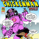
If you look closely in the background of the first few Captain Wonder strips which are set mostly in a comic shop, you will see the shelves are filled with real-looking comicbooks. I fabricated these in an effort to create a sense of verisimilitude; to make the world of Captain Wonder as real as I see it in my head. Either that or I’m a sado-masochist who does an inordinate amount of work to make teeny-weeny fake comicbook covers that nobody will ever notice!
Just click on the thumbnails below to view the covers. Scroll down to the bottom of each image for a bit of background info.


* * * * * * * * * * * *
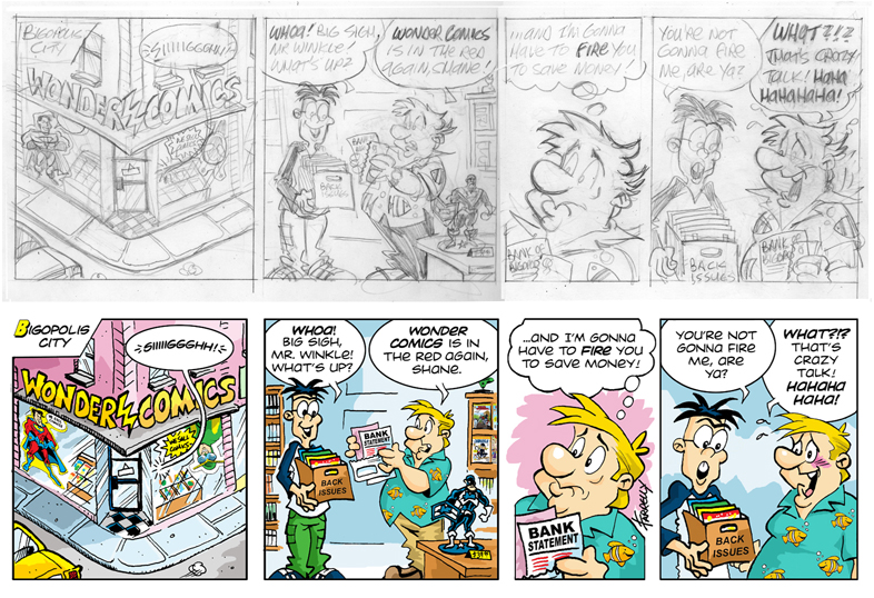
From time to time I will upload some material that shows the creative processes involved in creating a Captain Wonder strip. Below is the pencil drawing for the very first one, along with the finished version for comparison purposes. I think this was originally pencilled in 2003 or thereabouts and is the third or fourth version I did.
* * * * * * * * * * * *

Here’s the very first drawing I ever did of CW. It’s a biro pen doodle I did in an address book (remember those?) way back in 1995 when I had an office job. In this book I used to paste in pictures and doodle, just to liven it up a bit. I used to do a doodle beginning with the letter of the page I was looking up a number on. So under ‘A’ I did an apple, under ‘B’ I drew a ball and so on. I started getting adventurous and drew Frankenstein’s monster under ‘F’ and an ‘Egg Head’ under ‘E’. So one day under ‘C’, I drew this fat little superhero character and called him ‘Captain Wonder’. It’s a terribly badly drawn piece of art – just look at those hands – though to be fair, I was probably on the phone to a customer when I did it as that’s when I used to doodle the most. It’s totally different to the CW I draw now, but all the basic elements are in place – the stout belly, the earnest expression and the silly costume (glad I didn’t keep the floppy sock-like boots). I must have seen something in it even then because I drew it on a separate piece of paper and glued it into the address book. I also signed and dated the drawing and there’s a bit of Tipp-Ex used around his cape and back foot which means I cared enough about the doodle to make slight corrections to it!
Keep an eye out for more early sketches and embarrassing drawings!
* * * * * * * * * * * *
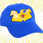
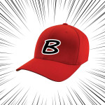
Something very cool for you all now! I know the Captain Wonder strip is in its early stages but I’ve been thinking of loads of merchandising ideas. Although Bill Watterson, who created my favourite strip of all time, Calvin & Hobbes, is a man of great integrity, I still don’t understand why he didn’t allow his creations to be merchandised. The fans wanted it, his syndicate wanted it but he didn’t want it. Aside from him making a lot of money (which isn’t the be-all-and-end-all) he would have given many people a great deal of happiness if they’d been allowed a Hobbes plushie to cuddle. And so, not being one to deprive anyone of anything, here are a few of my ideas for CW merchandise:


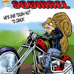
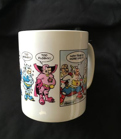
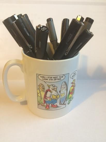
And here’s an actual, real piece of CW merchandise given to me by my best friend Garry, a man whose odd looks is only marginally outweighed by his great kindness. I was as thrilled as a squirrel on a motorbike when he gave me this! It features his favourite CW strip and it now sits proudly on my desk as I write this, holding all of my black Uni Pin Fine Line 0.5 pens, some of which I used to draw this actual strip! Use a mug to drink out of? Not me!
* * * * * * * * * * * *
And now…the moment you’ve all been waiting for…the secrets of Captain Wonder’s utility belt!
* * * * * * * * * * * *
And here’s a treat for you all – Captain Wonder has a video on YouTube! A team of monkeys with a camera worked round the clock to bring you these Wonder-ous videos which you can watch below. Enjoy!
* * * * * * * * * * * *
Down below is a cover I created for Fly-Fella, the CW Universe’s version of Spider-Man. I had a lot of fun doing this. I was originally going to use the cover of Amazing Fantasy #15 (Spidey’s first ever appearance, drawn by Jack Kirby) as the basis, but instead used the cover-that-never-was as drawn by Steve Ditko, the original Spider-Man artist. The story goes that Stan Lee rejected Ditko’s cover on the basis that it wasn’t dramatic enough and had Kirby redraw the same scene from a different angle. Both covers are lovely but I have a preference for the Ditko version. I’ve added both covers here for comparison purposes. The one on the left is the Kirby version that was published and the other is the rejected Ditko version.
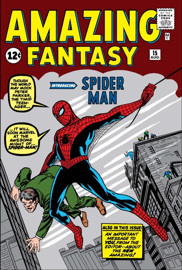

From a comedy point of view the Ditko one is better – the thug’s trousers riding up his legs, orange socks, a shocked man at the window, a purple building in the background and what looks like a foot sticking out of the thug’s butt, not to mention spidey looks like he’s about to slam into that wall! Yes, the Kirby version may be more dramatic, but the Ditko is funnier, which is why I created this:

Yes, folks – Dicky Ticker, the mild-mannered assistant credit adjustment clerk IS Fly-Fella. A rather unusual situation, I’d say. I have no idea what Fly-Fella’s powers are, but one of them seems to be having a miasma of buzzing insects always around him. He should be able to fly as well, but Peter Parker never had the ability to shoot webbing – he had to make that himself – so maybe Fly-Fella’s wings are just for show. Also, you won’t recognise the guy at the window…just yet. But you will.
* * * * * * * * * * * *
Another pencil/finished comparison for you. There weren’t too many differences to the two versions other than the redundant “TAILOR” signs in the backgrounds of the first and last panels. I removed that because it was pretty obvious the man was a tailor as he had a tape measure round his neck and CW is trying on costumes. What this comparison goes to prove is that the strip is 110% improved with the addition of good lettering and colour! More on the comic strip’s lettering in a later post. Bet you just cannot wait.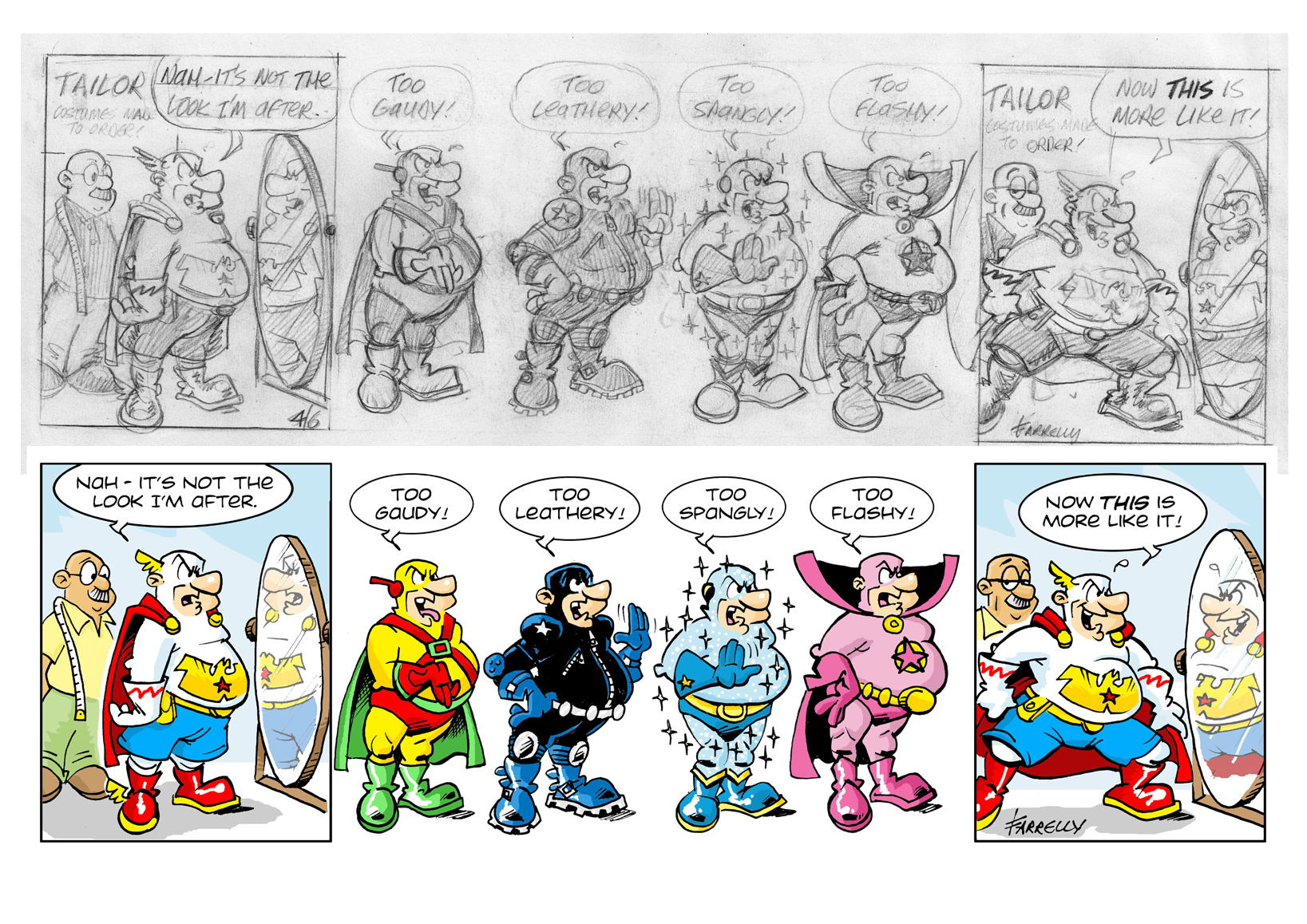
* * * * * * * * * * * *
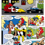
A rare treat for you all now. Stop pretending you don’t love these “how it was all put together” stories because I know you do. Now shush. I’m talking.
The TV interview sequence is one of the first sequences I wrote and drew when I first started drawing Captain Wonder and because I hadn’t quite gotten a handle on the character at that point, it took a long time to do. I drew all the strips as I thought of them as opposed to drawing them in order, a bit like how a film is shot out of sequence then edited together afterwards. It wasn’t until much later that I unified all the strips into the form that we all know and love now. Yes, love.
Below is a version I did of the strip where CW comes out of the deli and a TV news team is waiting for him. Below it is the version I eventually did. The top one was pencilled on 14th August, 2001 and the bottom one was pencilled 29th August 2005 – four years apart. (It wasn’t inked and coloured until 2015 – more on that in another post.) As you can see, there are some big differences in the drawing styles, although the gag itself remained virtually untouched.
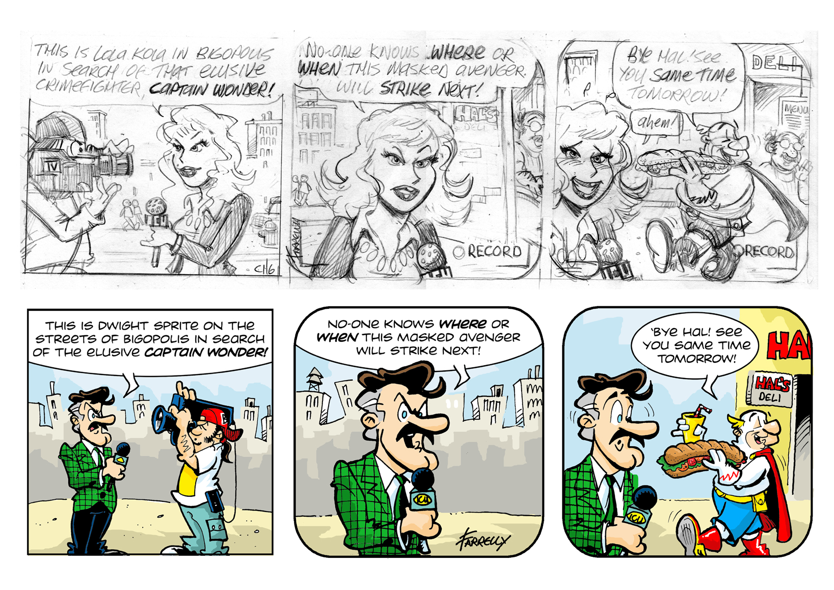
The first big difference is the semi-realistic look I gave the news reporter who’s called Lola Kola. Compared to CW’s cartoony look, they are miles apart. I’m not quite sure why I did this. I was used to drawing “realistic” adventure comics before I started drawing Captain Wonder and there is definitely a feeling of transition here, like I had a foot in both camps and the result is a weird hybrid of cartoon styles. The city street background is a lot more realistic than the one I do now, which is very stylized and certainly a lot quicker to draw. I have people and cars milling about in the streets in the distance, whereas in the colour version, there is no-one around except for the reporter and his cameraman. The reason for this decision? Well, these types of comics are usually reproduced at a very small size and the more detail you cram in, the less chance of it even being noticed. Also, what looks good at a large size may look crowded when it’s reduced.
Also, why did I go with the change of gender for the news reporter? I enjoyed drawing Lola Kola and I changed her to Dwight Sprite very reluctantly (though a different version of her can be seen in the strip that preceded this one where she got promoted to anchor). The reason? She was too distracting. She detracted from the focus of the strip which, of course, was Captain Wonder.
More details that were stripped back was the appearance of Hal, the deli owner in the second and third panels. He’s even waving in the last panel. If the gag can work without an element, then it probably shouldn’t be there. Sorry, Hal. Maybe another day. One other subtle difference that I made was to the gag itself. In the last panel in the original version, Lola is looking guiltily at the camera and saying “ahem” like she was caught out. The idea was that she knew CW ate at Hal’s at the same time every day and had “just happened to be there.” But in the version I went with, Dwight Sprite looks surprised by CW’s appearance – he really didn’t know he was going to be there. This was better as the punchline – the last panel – focused more on CW than on on the reporter. I think I was just sort of in love with Lola and wanted her to have more of a role, but I had to fire her, à la Eric Stoltz in Back to the Future. A few weeks of filming and it just didn’t work out and so, Dwight Sprite became my Marty McFly. (And If you don’t understand that reference you need to get in more.)
* * * * * * * * * * * *
We’re soon coming to the end of the first cycle of strips – all 50 of ’em! Most of these were originally conceived in the late 1990s and early 2000s. Most of them were pencilled between 2003 and 2005. Then most were inked three or four years after that. There was a big hiatus then I finally coloured and lettered them starting in August 2015. Why the big gap between each stage? There are a few reasons. The first is because of personal circumstances that I don’t want to go into too much detail here, but suffice to say working in a full-time office job while also trying to earn a living as a caricature artist and cartoonist on the evenings and weekends took up most of my time. Strips sometimes only take fifteen minutes to draw up – the simpler ones anyway – so I found it easy enough to pencil out a strip every few days or weeks.
Inking is a different matter. I was mostly not happy with my inking on most of these strips. Inking is a difficult discipline to master but is essential to the comic creation process. I often messed up the inking so I would have to go back and start over several times. So I started inking on tracing paper to save me having to re-draw the whole thing from scratch. It took me a while to get used to it and to the untrained eye, the inking looks OK but I am not happy with it on the whole. It looks clumsy and amateurish in places as I experimented with a multitude of inking materials and finally settling on the ones I use most comfortably today. (It’s a Unipin Fine Line pen made by the Mitsubushi Pencil company, according to the blurb along the side of these beauties.) These are what I use now to ink all my strips and I am mostly happy with the results. I think eagle-eyed readers will notice a slight shift in style from strip 51 onwards.
Overall, because of rushed pencilling and bad inking those early strips are, with a few exceptions, mostly ugly and clumsy. They are lifted out of the gutter only by the nice bright palette of colours I chose and the lovely lettering (using a font created by the legendary Watchmen artist Dave Gibbons). Photoshop is an indispensable tool to me now and I can wield it so much better today than I could have ten or fifteen years ago. But I can hardly look at the first fifty Captain wonder strips without wincing.
So why did I use those sub-par strips when I could have re-inked them all in the style with which I am now happy? First, life is too short. Ten years ago I drew and re-drew strips over and over and over, looking for that perfect composition or that beautiful line. Guess what? I never got it. Only age and experience has taught me not everything has to be perfect and indeed, nothing ever is perfect. The day you start thinking you have nothing more to learn as an artist is the day you should quit.
Second, I drew those strips throughout a particularly troublesome time in my life where some days I thought I was literally going crazy. By drawing Captain Wonder, I was prevented from becoming completely unhinged. That may sound melodramatic, but it happens to be true. So I owe it to that younger version of myself who went through what he went through to show the lines he actually made, not by erasing them and trying to achieve some unreachable level of perfection.
Third, and most importantly, my dear cousin Michael died last July aged just 36. He was taken so suddenly and swiftly, it made me realise that the time we all have left is so very precious and we should try and spend as much of it doing the things we love with the people we love. When he passed, I thought about all the things he had left undone, unsaid and unfinished and last August I took all the damn strips that were mouldering in a box and I did what I had to do to finish them, just so I could say, “There. I did that.” They’re only stupid comic strips but to me it is an achievement, albeit a minor one.
So, Michael – wherever you are, these are for you.
* * * * * * * * * * * *
Another fake comicbook cover for an upcoming gag in Captain Wonder.
* * * * * * * * * * * *
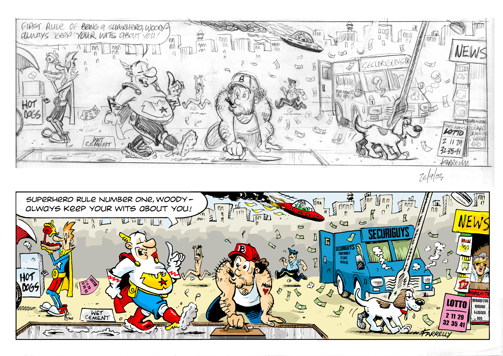
Here’s one more pencil drawing/finished strip comparison for you now. I know how much you love these. The date at the bottom of the pencil drawing says 26th September, 2003. Wow. It really doesn’t seem that long ago! I only got round to inking and colouring this strip last year – 2015, so that’s a 12 year gap between first sketch and final execution!
I really enjoyed drawing this strip. It was great fun thinking up things for Captain Wonder to completely miss out on. There are eight in all: 1) Woody isn’t even listening to him, but is busy buying a hot dog. 2) CW’s walking through wet cement. 3) There’s a naked guy running down the street being chased by a cop. 4) An alien spacecraft is making a crash landing. 5) A security truck has pranged a lamppost and is losing all its money. 6) A six-legged dog (for which there is a reward) is just moseying along. 7) A winning lottery ticket floats through the scene. 8) An elderly Elvis is running the news-stand.
Eagle-eyed readers may notice there is no Elvis in the news-stand in the pencil sketch. I only added him when I went to colour the strip because I thought the news-stand looked rather empty. I originally had Jimmy Hoffa, but I wasn’t sure anyone would recognise him, so I changed him to Elvis. Also, an interesting (well, interesting to me, anyway) note about making colour choices: in the pencil drawing, Woody is putting mustard on his hot dog. You can’t have a hot dog without mustard, right? But when it came to colouring the strip, I realised that Woody’s gloves, which are yellow, would have blended in with the mustard bottle he’s holding, which would also be coloured yellow. So for clarification, I coloured the bottle red, changing it to ketchup. This then means that one of Woody’s character quirks is that he prefers ketchup rather than mustard on his hot dogs which has come about because of the requirements of the art which of course must serve the narrative. Heavy!
I also realised that the tool the workman is holding in the pencil drawing was not the correct tool for the job he is doing, so after a quick bit of research (i.e. googling) found the right one and replaced it. In cartooning, rapid communication is key. Nothing says “burly workman” quicker than a drawing of a big guy with a baseball cap, cigar, broken nose and a ‘MOM’ tattoo.
One more thing – if anyone wins the lottery with those numbers (which I chose at random) can I get a share?
* * * * * * * * * * * *
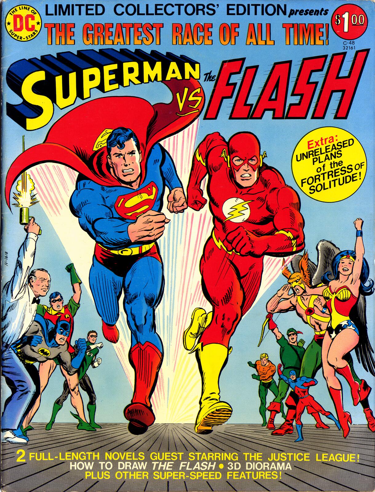

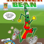
Superhero comics were always chock full of stories about two heroes having some kind of a misunderstanding and then fighting each other. But instead of that, unusually, from 1967 onwards, DC Comics released the first of many ‘limited editions’ featuring Superman and The Flash racing each other. I can never remember who, if anyone, wins or why they were racing. Who freakin’ cares, anyway? But the fans lapped it up and bought the comics in their thousands.
The Captain Wonder universe equivalents of Superman and The Flash are Hyperdude and The Zipper and I created this cover for an upcoming CW strip. Luckily, it is only going to be reproduced in the strip as a very tiny cover as my grasp of ‘realistic’ superhero anatomy leaves a lot to be desired, even when I’m directly copying it! That’s why I’ll stick to drawing the funny stuff, thank you very much!